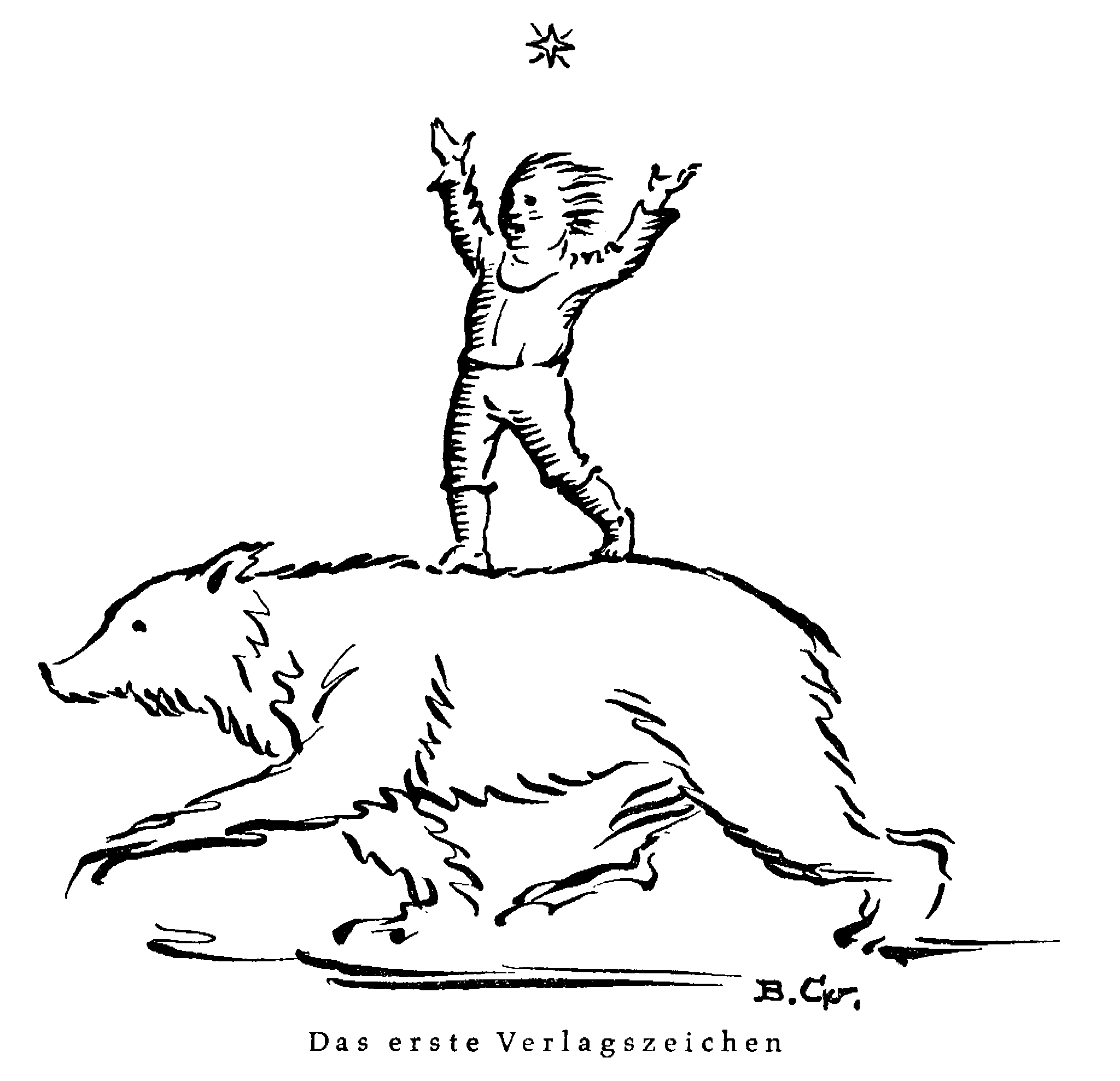
Although Karl Vötterle threw himself into the world of publishing in 1923 with a youthful lack of inhibition, even then he was no babe in the woods. As a bookseller’s assistant familiar with the conventions of the market and possessing an instinctive feel for the importance of bibliophilic details, he had immediately perceived the need for his company to have a suitable emblem, since “all great publishers had a signet” (Haus unterm Stern11949, p. 32). Vötterle already had a clear idea in his head when he boldly approached the well-known Munich graphic designer Bruno Goldschmitt (1881–1964), telling him that he “wanted to found a publishing house and that this publishing house was to be called Bärenreiter-Verlag […] I told him that the publishing house’s signet must show a bear, specifically a trotting bear, on this bear a boy must be standing, and this boy must be reaching for a star. In the bear I saw the world; the boy standing on this trotting bear and fearlessly reaching for the star naturally was supposed to be me” (ibid.). This reaching for the unattainable may seem like beginner’s hubris, but it is emblematic of Vötterle’s ability to “think big” and act accordingly. It was thus irrelevant that Breitkopf & Härtel, a competitor, already had a bear (based on the name of an inn) as the logo of its publishing house. Vötterle’s gaze was directed elsewhere entirely: towards the little star Alcor, the “little rider” in the constellation of the Great Bear – beloved of the members of the Wandervogel movement, a symbol of departure, leading the way. Bruno Goldschmitt accepted the commission.
Logo Neuzeit
Logo 1940
Logo 1934
Logo 1926
Logo 1923
Once the Bärenreiter publishing house was on a secure footing, the boy in the signet became obsolete. Goldschmitt drew a large four-pointed star and placed the bear below it on top of the three letters “BVA” (Bärenreiter-Verlag Augsburg). The logo was retained after the company’s move to Kassel in 1927; only the letters were dropped. With this further reduction, the logo had reached its final form. Apart from minor variations that appear in the early MGG volumes and in individual editions of sheet music, the signet was only adapted twice more: in the early 1940s, a time of major tribulation, Karl Vötterle commissioned the renowned Leipzig book artist and typographer Walter Tiemann (1876–1951) to adapt the logo true to one of his basic convictions – “Never skimp on the features; they’re worth it!” (Bärenreiter diary 1944, Jan. 4). Tiemann stylize the bear and star somewhat more strongly and set them in a circle like a seal. And in 1985, the time had come for a more modern signet, in keeping with the younger generation that was now in charge of Bärenreiter’s fortunes. It was to show a bear (not a polar bear!) striding powerfully and energetically with its head held high. The assignment was given to two Kassel artists who had just completed their studies: Axel Kretschmer and Bernhard Skopnik (both born in 1958). Their design has adorned all Bärenreiter editions since and, thanks to its timeless, balanced conception, will continue to accompany the publishing house into the second century of its existence.
For Karl Vötterle, the little star on the Great Bear that had fascinated him as a young Wandervogel remained “the binding symbol” of his work throughout his life (Haus unterm Stern, 11949, p. [5]), and the logo likewise is more than merely a reflection of Bärenreiter’s beginnings. Writing on the occasion of the publishing house’s 50th anniversary, Vötterle summarized: “When I started out in my hometown of Augsburg half a century ago, my gaze was fixed on a star […] Even today, I have not reached that star. But something intangible became the task and meaning of my life, and in retrospect, what seemed unattainable was in fact realized. The intangible something I mean is music” (Das Bärenreiter-Werk 22, 1973, p. 10).